Boy do I have a lot to share about the last five years.
Today’s story begins in 2020. For some time, I had been flirting with a particular idea for a side project: an alternative Twitter client focused only on your output. That is, no timeline. Just your posts. I wasn’t interested in competing with the official client, or the many excellent third-party options. I would lose. And nobody would care.
Admittedly, this wasn’t an original concept. There were options on the web to address this niche. But, I thought a native mobile option could be compelling. And — in fact — so did Twitter!
Bear in mind, these events took place when they were openly building v2 of the Twitter API. It was legit. With minimal hustle, I was connected to a PM. This was his intro:
I heard you were contemplating building a new app on the Twitter API and had some questions / concerns that you wanted to address before feeling confident doing so. We'd love to help however we can, especially as we continue to build v2 of the Twitter API and have a lot of ability to adjust our plans to meet the needs of developers like you.
Are you up for sharing a bit more about what you'd like to build and what questions you have?
Happy to find time for a phone call, too, if you'd prefer to chat that way. Thanks in advance!
Upon receiving clarification, he was enthusiastic:
Thanks for the details! The concept sounds intriguing and definitely something we'd like to support you in building.
We then had a really good call. My one sticking point concerned pricing. I had experience with a paid API dependency. I knew for a partnership to be sustainable, the payment plan had to be based on reality. He got that:
On your pricing question, the honest answer is that there's not a firm answer yet :) However, our thinking on how we might adjust pricing for the API is focused more on usage and how a developer charges moreso than size of an organization. This is a challenge we face today as a result of having a mostly one dimensional pricing model built for large enterprise B2B companies: that developers building apps that are sold for, say, $2.99 a month in the app store have no viable way to obtain higher access. What we imagine is likely drawing the line between B2C and B2B as an initial guide.
To be more succinct about the principle we have in mind here: we want to align incentives so that success for developers = success for Twitter. That only works if we have flexible options for different developer models and circumstances.
Does that help?
Exactly.
The pay-as-you-go model is what made — more than anything — Dark Sky an indie dev darling.
I was optimistic, but I clarified that until pricing has been confirmed it would be unwise to commit to the project. He understood.
Awesome. Can't wait to see what you come up with!
That’s where the conversation ended.
One year later — still no confirmation. Then shortly later — this happened. And the rest is unfortunate history.
Over the 2023 Christmas holidays — after a three year itch — I finally scratched. The trigger was discovering TootSDK. Freed of the burden of the boring work connecting to Mastodon, I quickly prototyped the original vision. But, of course — like any self-hating indie — I couldn’t resist perfecting the pitch. Yesterday, I finally relented. I announced it to the world.
Tusks is now available on the App Store.
I’ve been wanting to write more for several years. But, for whatever reason, I’ve been unable to develop a rhythm for it. Well, until a few months ago, when I started a newsletter for anyone interested in the latest insider developments at Third Culture Apps. I feel like I’ve finally the perfect combination of platform & audience to encourage me to keep writing. One episode every Sunday morning, now ten weeks in. You can binge read & sign up to Third Culture Letters today.
You were great to me. I know when I look back in 5, 10 etc. years time, I will always come back to you as the point when I experienced actual clarity. Being 34 now, every day I genuinely feel like I'm making up for lost time. I forgot my ambition. But I remember it now. And clearly. Can't wait for the next decade to begin.
I started the year optimistic. But with nothing shipped until the summer, and getting traction tough, a lot of the year was characterised with uncertainty. I began to question whether this is actually sustainable in general and for much longer even.
October offered unexpected encouragement.
Today, I'm feeling good.
Both Appy Weather and ruff were both selected as Google Play Best of 2019 winners. Next year 💪
I originally started work on ruff from a business and creative need to have a side-project to complement Appy Weather's development. There were many moments throughout the year where it made sense for me to abandon ruff, both before and even after its release. I thought it, others would say it and the numbers would support it. But I just couldn't. And I'm glad I didn't. ruff won a 2019 Material Design Award yesterday.
At the start of 2019, I quit a stable job at a studio I've been associated with since I was 15, having been extremely fortunate and privileged to spend the last few years leading a team of talented humans. I was 33, and wanted a new challenge. Third Culture Apps was founded. Six months later, I'm proud to have released its first two apps on Google Play: Appy Weather and ruff. Check them out.
Before releasing Appy Text, beyond knowing that there are ~500 million Windows 10 potential users, I had no idea how it would do as it was my first UWP app. I did however expect it to do better than my previous app, Appy Weather, because 1) Windows has more users than Windows Phone and 2) Appy Text was going to be free with an in-app purchase, whereas Appy Weather had a three day trial before you needed to pay. For a $3.99 weather app on the number three mobile platform, Appy Weather performed admirably. In general though, it did okay. It's now been a few months since Appy Text was released on the Windows Store, enough time to re-calibrate my expectations moving forward for Appy Text as well as the Windows Store. Here are the numbers.
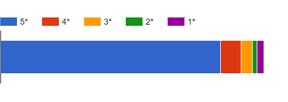
Firstly, to get an objective feeling for the quality of the app that the numbers are linked to, please consider its review rating of 4.7 based on 116 reviews so far.
Also worth considering is that although I'm not a famous developer on the platform, I've a bit more reach than someone who is releasing their first app.
Appy Text has been downloaded 7,861 times in three months.
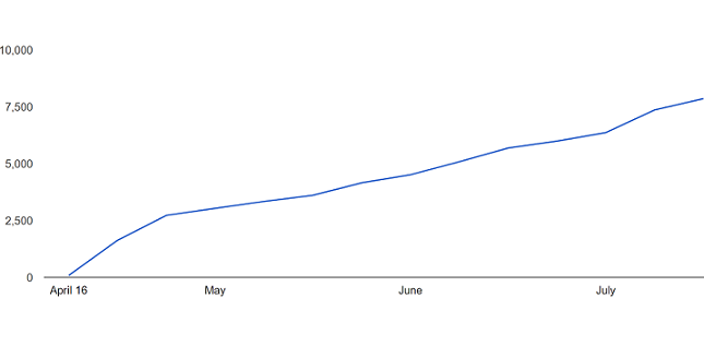
For comparison, Appy Weather has been downloaded 24,328 times. That is, Appy Text has in three months reached one-third of the downloads Appy Weather managed in three years.
These are the daily download numbers:
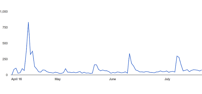
Those spikes occurred whenever the app was mentioned on a reputable website. Michael Allison's MSPoweruser review helped the app hit a peak 833 downloads for a day on April 23, less than a week after the app was released. The least number of downloads it's managed in a day is 23; however, outside of the aforementioned spikes, the app was on average downloaded around 50 times a day in the first three months.1 Obviously this isn't anywhere near Windows 10's estimated user base, but it's nonetheless a solid number to work with. But, remember, the app is free with a Premium in-app purchase that was on sale at $0.99 for the first couple of weeks before changing to $3.99. There are 472 Premium users.
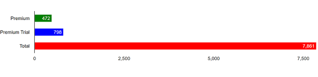
That's around 6% of downloads becoming paid users. That may seem little but it's actually normal. I'm okay with this free-to-paid user conversion ratio2 but I'm not with the percentage of users activating the free 30-day Premium trial. This warrants a separate post where I'll elaborate on what who is responsible for this (me) and steps I'm taking to address this (first changes have already resulted in a meaningful bump). For comparison, Appy Weather has a respectable more-than-nine but less-than-ten percent conversion ratio with 2,312 paid users.
The app's been downloaded the most in the United States. This is the top 10:
- United States - 2,477
- Germany - 787
- Russia - 644
- India - 464
- United Kingdom - 422
- Poland - 319
- China - 308
- France - 237
- Canada - 174
- Italy - 152
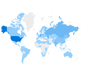
Worth mentioning are a couple of countries in Appy Weather's top 10 downloads that are nowhere near Appy Text's top 10: Vietnam (third, yes third, behind the U.S. and U.K.), and Mexico (10th).
As for the spread of Premium users, it's mostly similar with China and Italy making way for Australia and the Netherlands:
- United States - 173
- Germany - 60
- United Kingdom - 44
- Russia - 21
- Poland - 19
- India - 12
- Australia - 11
- France - 10
- Netherlands - 9
- Canada - 9
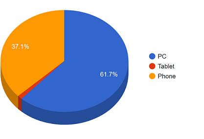
Finally, and this is possibly the thing that took me most by surprise, although the app has been downloaded mostly on the PC, as was expected, phone downloads are not insignificant. Tablet downloads however are - they're less than a hundred. Special mention to the one user who downloaded the app from a Windows Server device.
These are my key takeaways:
-
The Windows Store is bigger than the Windows Phone Store.
-
But Windows Mobile 10 users shouldn't be ignored. Not yet anyway.
-
Being a free app makes a big difference in terms of downloads.
-
However, it's easier converting trial users to paid users when the app stops functioning at the trial's expiry.
-
And so I've ended up with (many?) free users who I'm not making any money from.3 Unless ads.
- But if I continue to reject monetising through ads then Appy Text is highly unlikely to ever make generate revenue per month to enable its development to become a full-time gig.4